

What do color processes have to do with your packaging, and why should you care?
Color for packaging is influenced by two main processes that will have an affect your packaging’s quality, consistency and cost. The subject of color printing is vast and complicated. But I will try to generalize and simplify in an attempt to keep things relevant to you and your packaging needs.
First, let me name the two main types of color processes.
1. The first type of color process is referred to by any of the following names (and probably a few more, but these are the main ones I’ve heard on a regular basis)
PMS (Pantone Matching System) COLOR
SPOT COLOR
SOLID COLOR
PANTONE COLOR
PANTONE MATCHING SYSTEM
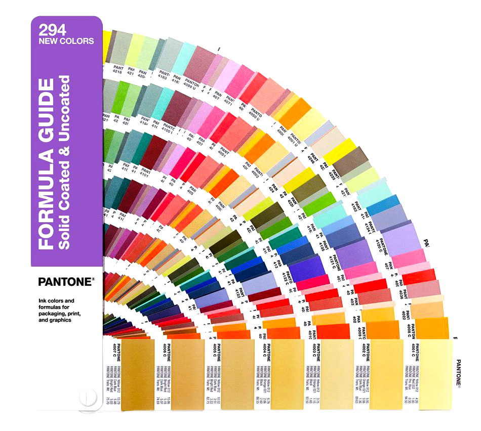
These are pre-mixed ink formulas or “recipes” developed by the Pantone Company. It is the industry standard. Below is a swatch booklet of PMS Colors from Pantone.
2. The next type of color printing process uses percentages of four colors to create a virtually unlimited array of colors and can be referred to by the following names:
4 COLOR PROCESS
4 COLOR BUILDS
PROCESS COLORS
4C PROCESS CMYK
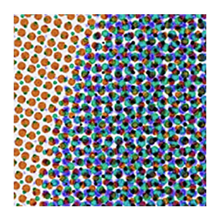
The four colors that are used are C (cyan), M (magenta), Y (yellow), and K (black). The 4 color process uses very tiny dots when it prints as opposed to a solid bed of ink used by the PMS color method. Below is an image of what this printing method looks like magnified.
So, when your artwork is being designed in Adobe Illustrator, or InDesign, or some other graphics program, there are options for the graphic designer to choose to use CMYK color which is the 4 color process, or PMS colors which are chosen from a color palette. Your graphic designer should be fully aware of this.
Now for the important bit. When deciding what type of color to use for printing on your packaging, ask yourself the following questions:
1. Does my packaging artwork use less than 4 colors? (remember black counts as a color too)
2. Does my packaging artwork have full-color photographic images?
3. Does my packaging artwork require accurate color consistency from printing job to printing job?
4. Does my artwork contain very tiny type or ultra thin lines (0.5 line weight or less)?
5. Does my packaging artwork contain metallic or fluorescent colors?
If yes, PMS colors are a must. The 4 color process will not be able to achieve these colors convincingly.
Brief Summary:
PMS COLORS:
- Yield more vibrant and brighter colors
- Great for color consistency
- Usually cheaper if you use less than 4 colors
- Great for tiny type and ultra thin lines
- Ideal for metallic or fluorescent colors
4 COLOR PROCESS:
- A must if your packaging artwork contains full-color photographic images
- Great if you are using a ton of colors because once you decide to use the 4 color process for your packaging, the amount of colors you can use is practically unlimited
USEFUL TIP:
If you are using PMS colors, try using different “tints” of the same color.
For example if you are using one of the many types of red offered by PMS colors and you want to add some pink somewhere in the artwork, instead of choosing a pink PMS color, opt for a “tint” of the red you are already using.
In other words, in the graphic design program you are using for your packaging artwork, lower the opacity of the red to, say, 50% to create pink. That way, when your packaging is made at the factory, that “pink” color will not be considered an additional color. It will only be considered as a “tint” or “shade” of a color you are already paying for. The less colors you use, the less expensive, in most cases.
Packaging color is an important part of the printing process and one that should be understood, as if affects price and quality.
This has been a part of my tutorial series called How to Buy Packaging 101. So click the link below to head back if you haven’t finished reading it yet. 🙂