

When it comes to folding cartons (an industry term for a product’s retail box packaging) many packaging buyers believe that all the fancy packaging graphics printed on ordinary white paperboard (what the folding carton is made of) is what wows the customers and sells the product. They erroneously believe that all the magic happens at the packaging manufacturer’s print shop. But the true “wow factor” actually comes from the paper itself. There are so many stunning colors and luxurious textures available from premium paper; the truth is, the real magic actually happens at the paper mill.
When you start off with the perfect backdrop of colored and textured paperboard (or folding board as it is also called) minimal printing is often required. In fact, when a folding carton is made from this type of elegant, stylish paperboard, often a foil stamp or minimal spot colors are all that is needed for your product’s packaging to look stunning on retail shelves.
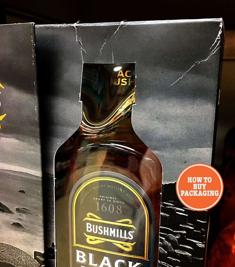
Because the color in premium colored paper is dyed completely through (and not just on the surface like ordinary white paperboard that gets printed on with ink), cracking (areas where the ink flakes away) does not occur.
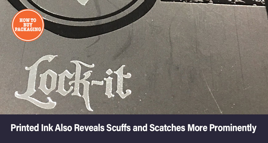
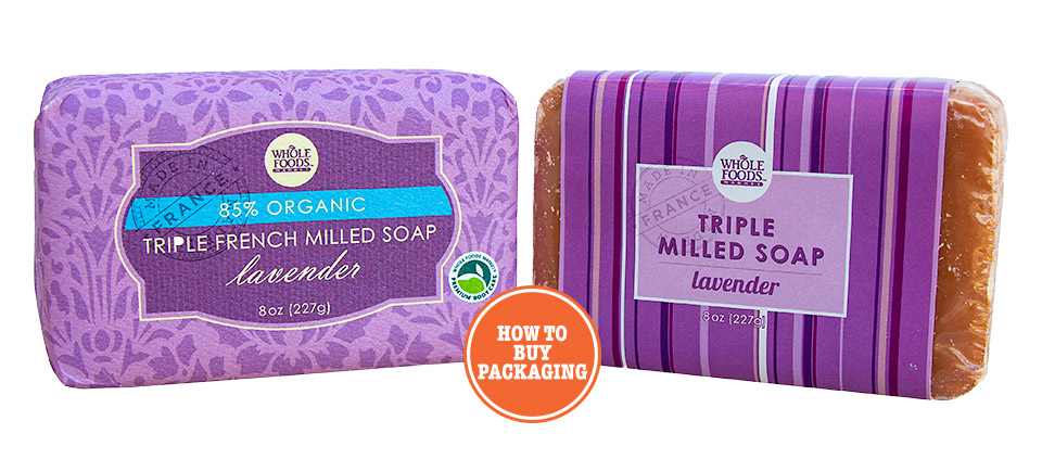
It does, however, occur on ordinary stock white paperboard. Look at the images below. The ink flakes off showing the plain white board underneath; against dark colors this phenomenon becomes extra apparent.

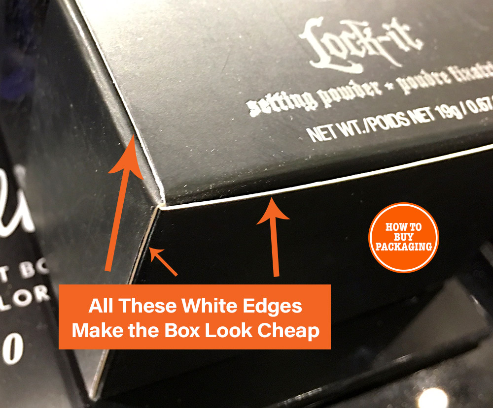
White edges are also a common flaw on box packaging that is trying to look elegant and classy. If this company was using black matte finish premium paper instead of ordinary white paperboard, they would not have had to cover the box with black ink, all the edges would have not been white, and the scuffs and scratches on the box surface would not have been so pronounced, if visible at all.
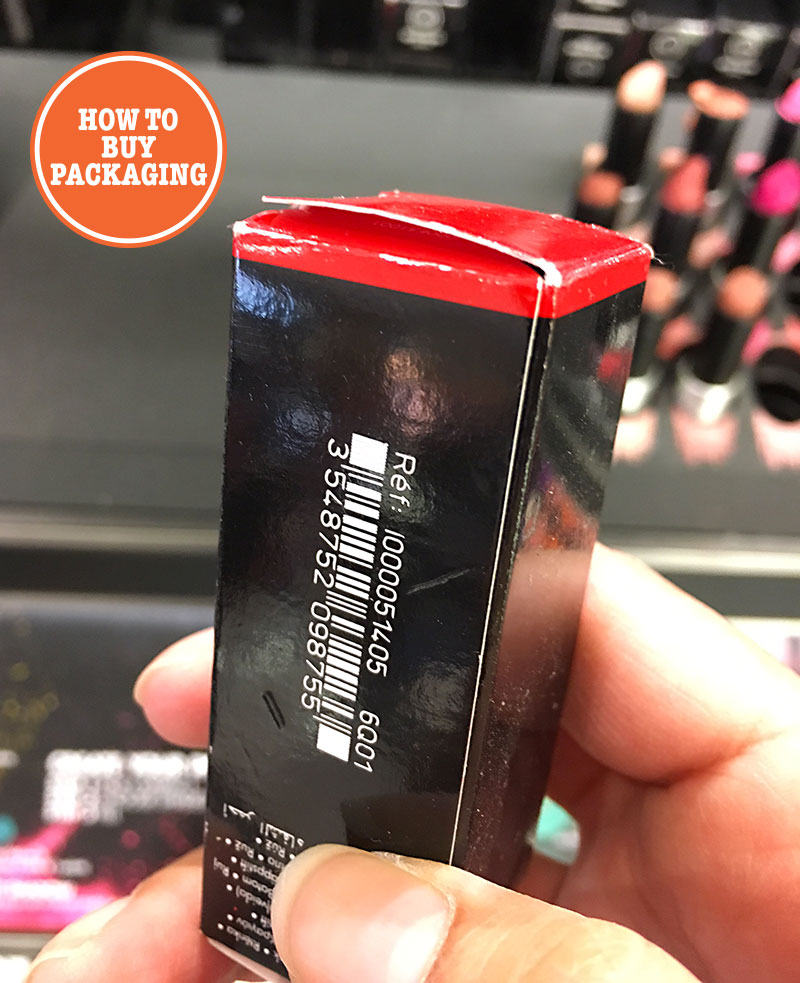
This next image shows a cosmetic box that could have easily used premium colored paper instead of white paperboard covered in ink. Add a foil stamp and this box could have looked so much more luxurious with no white cut edges to spoil the show. And as premium paperboard is so much more durable and sturdy, this box would definitely fair better when handled by curious customers.
As mentioned in my article on color consistency, having colors look the same from packaging run to packaging run can be difficult. The human eye can detect the slightest variation in hue, especially when doing a side by side comparison. I, myself, have even hesitated buying a product because of differences in color from one box to the next on a store shelf, wondering if it was simply just a color issue with the packaging or if the product was actually counterfeit or grey market.
So it’s certainly important to have color consistency in your packaging, especially if color plays a large role in your brand identity.
Using a colored paper from a quality paper mill can enable you to achieve very accurate color consistency. And if you want to change packaging manufacturers, you’ll fair much better as far a consistency using colored paper, rather than relying on the new manufacturer’s stock paperboard and inks.
Won’t premium paper make my packaging cost more?
No, not necessarily. In fact, there could easily be instances where your packaging could actually cost less by switching to a premium paperboard.
It costs a lot of money to set-up large offset printers. There is a lot of skilled man-power and time involved. When you get your graphics printed on your folding carton packaging, you will have to pay for these set-up costs. And anything in addition to basic printing i.e. foil stamping, spot gloss, embossing etc. are all done “offline”. That means that the paperboard (your packaging that you have just had your graphics printed on) now has to be moved to separate machinery for these processes; more time and man-power (that you, of course, pay for).
Now, consider a gorgeous pre-colored and debossed paperboard (created right at the paper mill). Imagine working with your clever graphic designer (who has experience in print, not a web graphics designer – don’t get me started) to create a folding carton box design that doesn’t require 4-color process printed graphics, color matching etc. but instead just uses elegant foil stamping. One step. No printing necessary. No white unprinted edges on the box. A sturdier, more sophisticated look and feel for your custom box.
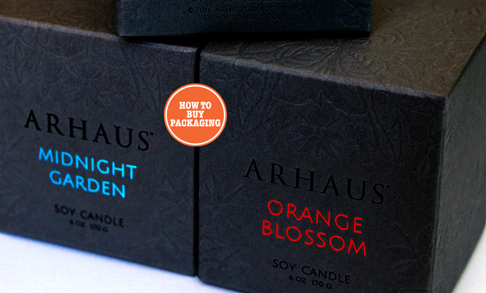
The paperboard is delivered to the packaging manufacturer fully colored and, in this case, debossed (the pattern method). All that is needed is simple foil stamping. The extra cost for the premium paperboard is offset by reduced amount of printing required.
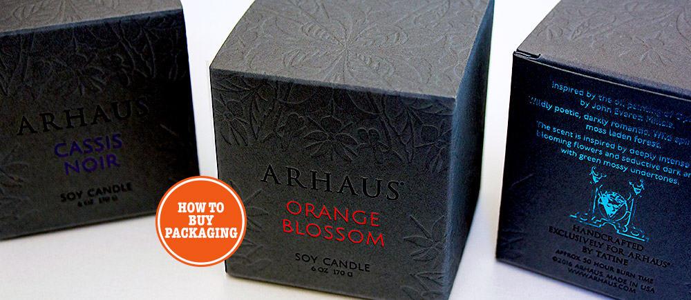
Here’s another example:
Again, this box does not use any standard printing methods, just foil stamping.
This is definitely an instance of less is more, which is often the case when you start out with beautiful paperboard as your packaging design canvas.
This textured paperboard feels great. It suggests a product that is as superior as the box it comes in.
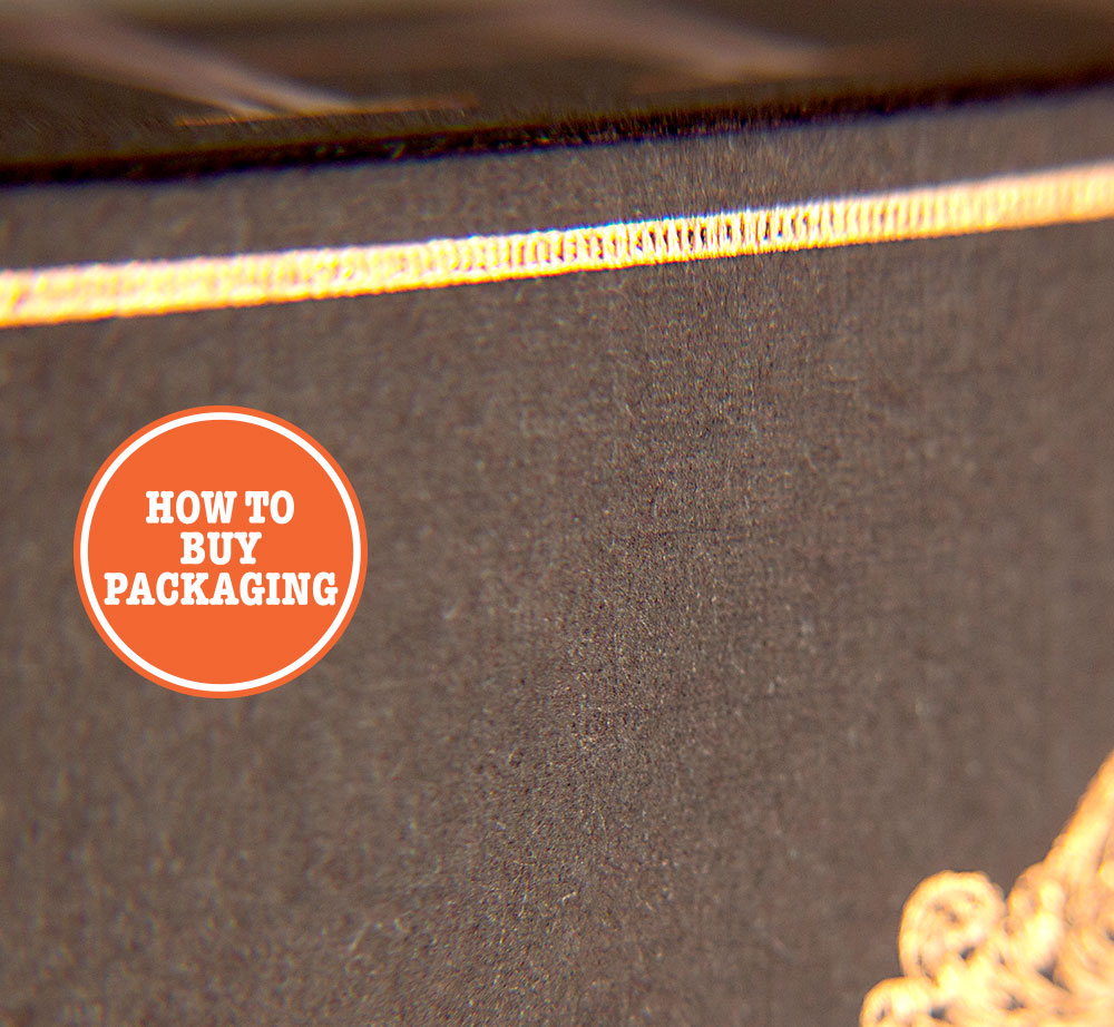
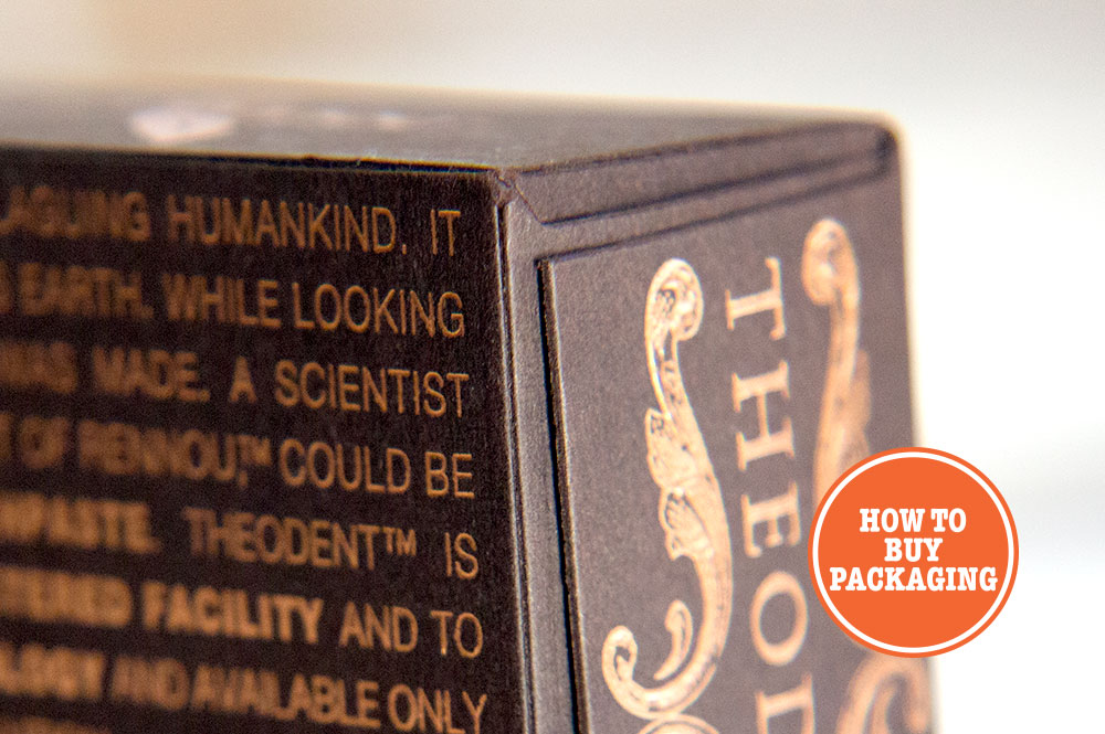
Look Mom! – No ugly white cut edges to visually interrupt the packaging presentation!
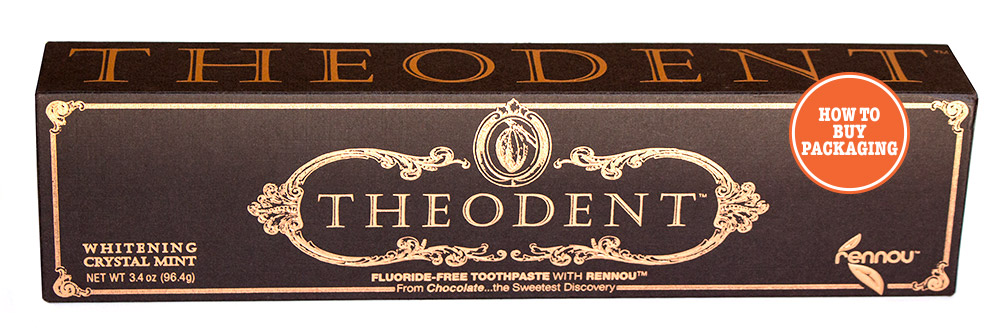
So here’s a (non-paperboard) example of a premium paper being used to great effect:
I find that the “fancy stuff” is done better at a paper mill.
- The paper is sturdier and performs better at the retail level
- Colors, textures and patterns offered by premium paper mills are seemingly endless – realistic looking metalized and leather finishes, scintillating jewel tones, deep blacks, unique duplexes
- Color matching is no longer an issue
- The packaging stands out amongst competitors and looks richer
- No ugly white cut edges on the packaging
- Scratches, cracks and scuffs are much less apparent
But just to be clear – I do not wish to suggest that print is obsolete because of fancy paperboard. Not at all. There are some brands that would have a difficult time transitioning away from ordinary white paperboard due to the established branding that traditional printing methods have afforded them. I would like to suggest, however, that not only does premium paperboard make sense from a quality standpoint, but using premium colored and/or textured paperboard also opens up a whole new world of refreshing creative possibilities that your packaging and graphics designer should appreciate.
This has been a part of my tutorial series called How to Buy Packaging 101. So click the link below to head back if you haven’t finished reading it yet. 🙂